This link is about Flash Tutorial. There are many interested tips and effects in Flash for you and me to practice.
http://www.tutorialized.com/tutorials/Illustrator/1
Sunday, 7 September 2008
I searched these links for improving skill in using Illustrator. Some people mainly use photoshop to create their own products and they rarely use Illustrator. I hope those link below will help. It gathers a lot of tips, tutorials and many things else for this software.
http://www.vtc.com/products/Adobe-Illustrator-CS3-Tutorials.htm
http://www.tutorialized.com/tutorials/Illustrator/1
http://www.vtc.com/products/Adobe-Illustrator-CS3-Tutorials.htm
http://www.tutorialized.com/tutorials/Illustrator/1
POPULAR FLASH FILE
This website I found contains many popular and professional file about Flash. I have done my porfolio using Flash before, but whenever I watch again this flash files which made by professioners, they really inspire me and motivate me to practise on Flash more. Here is the link, come and look at it ^^
http://flashden.net/page/top_sellers
http://flashden.net/page/top_sellers
Photoshop Tutorial
These are some website I found for creating or fixing images in Photoshop. These links are very useful for anyone who want improve more skill in using Photoshop. :)
http://photoshoptutorials.ws/
http://www.photoshopsupport.com/tutorials/cs3-photoshop-10.html
http://www.tutorialized.com/tutorials/Photoshop/1
http://photoshoptutorials.ws/
http://www.photoshopsupport.com/tutorials/cs3-photoshop-10.html
http://www.tutorialized.com/tutorials/Photoshop/1
Sunday, 31 August 2008
Character for Final Project

My flash tutorial is about "How to raise hamster" ^^. I really don't know how to draw a hamster, so I traced it in Illustrator. Well, I feel my hamster doesn't look like a hamster at all. T__T. Maybe I will draw another one... At first I just wanted to make it like a cartoon character, but I think I've changed my mind a liitle bit.. --__--
Sunday, 24 August 2008
Background of Flash Porfolio
This is my background for Flash Porfolio. I love Kagaya art and I love the game Final Fantasy. That's why I made this background full with stars and look a little fantasy. And this also my style too! :) :)
First I used brush in Photoshop create the logo and the full-star background with flowers and leaves, then I traced them and colorised them in Illustrator.
First I used brush in Photoshop create the logo and the full-star background with flowers and leaves, then I traced them and colorised them in Illustrator.
Flash DIM1 _ Modernism Typography
This is my last assignment I did in the last semester. My topic was Modernism and I made it in Typography style. It was my very first time using Flash. I just moved and animated the letter. I didn't understand much about the steps using Flash. It was not very good because I used so many different fonts and that was my mistake.
The sound I took from the movie "Transformer" 2007. In Flash, I maximized some letters on purpose, I wanted to highlighted them for telling there's another meaning in this conversation.
Here is the link to my flash: DIM1 _ Flash Project
The sound I took from the movie "Transformer" 2007. In Flash, I maximized some letters on purpose, I wanted to highlighted them for telling there's another meaning in this conversation.
Here is the link to my flash: DIM1 _ Flash Project
Sunday, 17 August 2008
Five basic elements
Have a look!! ^^ I only used Gradient Tool to create background and Brush Tool to do patterns. Some patterns I reduced the opacity. As you can see, this image I made is about the five basic elements of the universe: metal, wood, water, fire, earth based on Chinese astrology.

five basic elements
METAL
"Water is the symbol of emotions" and "it is considered as a cleansing element" according to Chinese astrology. Blue is the symbol color of Water element. Water usually don't have an clear shape but it can be represented by fish ponds, aquariums,...

five basic elements
METAL
According to Chinese astrology, "metal is the symbol of autumn season and also of the tools that are used for harvesting of the produce." The colors present metal including silver, white, pastel and metallic. Moreover, in general, anything that are round, circular or spherical shapes and made of gold, copper, silver, brass or stone,... present the METAL.
In Chinese astrology, "wood represents the nature's creativity and is associated with spring and new life" and "all the plants, flowers, trees and things made of wood are representing this element". The symbol color of Wood is usually green and the symbol items of Wood are flowers, plants, trees or have tree-trunk shape.
WOOD
In Chinese astrology, "wood represents the nature's creativity and is associated with spring and new life" and "all the plants, flowers, trees and things made of wood are representing this element". The symbol color of Wood is usually green and the symbol items of Wood are flowers, plants, trees or have tree-trunk shape.
WATER
"Water is the symbol of emotions" and "it is considered as a cleansing element" according to Chinese astrology. Blue is the symbol color of Water element. Water usually don't have an clear shape but it can be represented by fish ponds, aquariums,...
FIRE


In Chinese astrology, summer is what the Fire element presents. Orange and red are the colors of it. The items symbol for Fire are candles, stoves and hearths.
EARTH


Chinese astrology says that "the Earth nurtures all form of life" and "it represents solidarity and grounding." The color associated with it are yellow, tan or natural tone, mostly brown. In addition, rocks, bricks, stones are represented items of Earth element.
Link:
Chinese Astrology
The Five Elements of Feng Shui
Link:
Chinese Astrology
The Five Elements of Feng Shui
Tuesday, 12 August 2008
Last night, when I was trying to make a logo for my flash portfolio and I only use Brush Tool to create some shapes, I accidentally cause some results which look like an animal or a person. Have a look!! ^^

Logo Samurai with 4 hands >:) ( sometimes it looks like a butterfly also..)

This one is in a girl-head-shape. Well, you can see the eyes, neck, curly hair and a hat. Some of my friends feel it looks like a head of a alien. X__X

And this is a buffalo head with a dog nose and deer horns!! :D :D

Logo Samurai with 4 hands >:) ( sometimes it looks like a butterfly also..)

This one is in a girl-head-shape. Well, you can see the eyes, neck, curly hair and a hat. Some of my friends feel it looks like a head of a alien. X__X

And this is a buffalo head with a dog nose and deer horns!! :D :D
Sunday, 10 August 2008
EXAMPLES OF FLASH PORFOLIO
I have just known this website recently and I want to share it with my friends who studying DIM2. I have to say that I love this website! ^^ It has so many great professional examples of Flash Porfolio, which is my next assignment. I think this web possibly help me and you guys come up some ideas when you are doing your porfolio in flash like how you format, choose backkground or what effect you will use... And in addition, it can help you understand more a little bit how a porfolio look in flash. I think some people already know this website, but who don't know this website, go in and take a look. It's very great!!
If you want to look at some examples of Porfolio in Flash, choose the green bar.
If you want to have some ideas for making a brief introduction for flash porfolio, choose the yellow bar.
Link and website's name: Entheos Templates
Monday, 4 August 2008
POSTER TIGER
Well, my work is very simple. I only use these images and combine them into one, then I change color and some effects on each picture.
 main background image
First, I chose the first image to be main background and create it into another layer. The picture is a little dark, so I have to change Saturation, Levels, Contrast and Inner Shadow.
Next, I open six different tiger images, then I drag it to the background image and there will be a layer created for each of the tiger images.
One by one of tiger images, I use Eraser Tool to erase the background around the tiger image then I use 'Free Transform' to resize it. After finish, I do the same thing I have done with the main image: changing Saturation, Levels, Contrast and Inner Shadow. (Some tiger images are too bright so that I have to use 'Match Color' to change 'Color Intensity' and 'Luminance' to make it suitable with the main background image.)
Finally, I put each of the tigers at properly place in the main picture and reduce their 'Opacity'
Link for the images I used:
http://www.pixelperfectdigital.com/free_stock_photos/showphoto.php/photo/5034
http://www.pixelperfectdigital.com/free_stock_photos/showphoto.php/photo/5255
http://www.stockvault.net/Cats_and_dogs_g71-Tigers_p12019.html
http://www.pixelperfectdigital.com/free_stock_photos/showphoto.php/photo/5035
http://www.pixelperfectdigital.com/free_stock_photos/showphoto.php/photo/1031
http://www.stockvault.net/Animals_g1-Tiger_p9921.html
http://www.pixelperfectdigital.com/free_stock_photos/showphoto.php/photo/5031
Sunday, 27 July 2008
Playing with flash
This is the exercise for practicing Flash Animation. So i just use some basic steps that I have learnt so far. I have some ideas to make this animation look more interesting, but now I show the first idea of video flash first, then I will make another video flash in the next entry using this animation, too.


TRACING ANIMAL
Ok, this time I try to trace an animal (a cat). Well, I didn't intent to trace it like I traced a car last time because tracing a real animal is quietly difficult to me and the result won't look as real as the original anyway. T.T That's why I decided to make the new image in contrast between black and white (I also used other colors to highlight the nose and the eyes).
I didn't trace the whole things of cat. I only traced the eyes, nose and I chose some veins on the cat's face to trace because I think they will make the picture look interesting. Doing in this way is easier and not time-consuming like when I drew my car before.

Original

Tracing image
I didn't trace the whole things of cat. I only traced the eyes, nose and I chose some veins on the cat's face to trace because I think they will make the picture look interesting. Doing in this way is easier and not time-consuming like when I drew my car before.

Original

Tracing image
Note: Actually, I was inspired when my teacher Lip Ping was showing the poster to the class. One student (Sorry, I don't remember the name) had traced the tiger in contrast like this. So I wanted to try tracing in that way, too. >:) >:)
Original Reference:
http://www.burningwell.org/gallery2/v/Animals/Bernice.jpg.html
Original Reference:
http://www.burningwell.org/gallery2/v/Animals/Bernice.jpg.html
Monday, 21 July 2008
TYPE CREATURE
This is my DIM 1 exercise: TYPE CREATUER. Choose the type font and then use it to create an animal. ^^
The font I use is ParkAvenue BT. I think it’s kinda easy to make a butterfly with a font like that. Well, can you guess how many letters I used to create my butterfly? :P :P
Oh, one more thing: if you look at the image at a far distance. You’ll see a mark or something like a face instead of a butterfly. Try it!! ^^

Sunday, 20 July 2008
Tracing car
Well, this is my first time tracing a car, so it doesn’t look as good as I want it to. Anyway, I tried my best. ^^. This car I found it when I was searching Google. It is name Lamborghini-Gallardo-Superleggera-2007. I like the design of this car, so I decided to trace it. ^0^
Actually, I have spent only nearly 2 days to finish it. I drew the line of car in about nearly 9 hours in one day. Yeah, I can draw the line in one day, but coloring it with Gradient… ---__---. It took me another one day and a half to color it. I am not getting used to pain anything in Illustrator, so I must spend some times at first to get over it. OK, here my car before I pained it.
And after coloring…. TADAH ^^
Actually, I’m still not very satisfied with this because there are some problems in that image. I think you can see it. Well, I will fix it soon.
Actually, I’m still not very satisfied with this because there are some problems in that image. I think you can see it. Well, I will fix it soon.
And this is just a combination of original image and my tracing car. The car above the shadow is still my work. I just borrowed the shadow of the original image.
Sunday, 13 July 2008
TWO SIDES OF LIFE

About the image above, I changed its position, then I erase background and paint the object (the girl) into black color.

I made this image with a content about 2 sides of life: sadness and happiness, or failure and success.
Reference: http://www.istockphoto.com/file_closeup/concepts-and-ideas/emotions/6493749-sadness.php?id=6493749
Reference: http://www.istockphoto.com/file_closeup/concepts-and-ideas/emotions/6493749-sadness.php?id=6493749
Combine different images into one
This time I use three different images and combine them into one picture.


Firstly, I use Clone Stamp Tool to vanish the word Istockphoto and the other unnecessary things at the 3rd images, then I save it into another file. About the two other images, I use Eraser Tool to erase the background around the object and then I drag them to the new 3rd picture which I have saved before. After that, I use History Brush Tool to erase more remained unnecessary parts. Finally I use Brush Tool to add some effects to the new image.


Firstly, I use Clone Stamp Tool to vanish the word Istockphoto and the other unnecessary things at the 3rd images, then I save it into another file. About the two other images, I use Eraser Tool to erase the background around the object and then I drag them to the new 3rd picture which I have saved before. After that, I use History Brush Tool to erase more remained unnecessary parts. Finally I use Brush Tool to add some effects to the new image.

This is not well because if you look at it carefully, you'll see it doesn't look smooth at the green borders. Using History Brush Tool or Eraser Tool is time-consuming and my hands are not skillful enough to use them. Do you have any suggestions for me?
Reference:
http://www.istockphoto.com/file_closeup.php?id=2951125
http://www.istockphoto.com/file_closeup/celebrations-holidays/easter/5383746-spring-flowers.php?id=5383746
http://www.istockphoto.com/file_closeup/concepts-and-ideas/modern-life/3781332-enjoying-the-sun.php?id=3781332
Reference:
http://www.istockphoto.com/file_closeup.php?id=2951125
http://www.istockphoto.com/file_closeup/celebrations-holidays/easter/5383746-spring-flowers.php?id=5383746
http://www.istockphoto.com/file_closeup/concepts-and-ideas/modern-life/3781332-enjoying-the-sun.php?id=3781332
Sunday, 6 July 2008
PLAYING WITH PHOTOSHOP - 2nd time
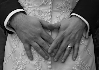 I'm going to practice with Photoshop in this entry again.
This original image is black and white color and that makes it look old. So before fixing or changing it, I firstly go to Image, then go to Adjustment and I choose Curves. A small window with the line map is opened and there are 3 symbols with syringe-shape. The left one is for dark area in the picture (usually black color area), the right one is for bright area (usually white area), and the middle is for the area between black and white color.
After I done selection, I have a new picture and you'll see the difference.
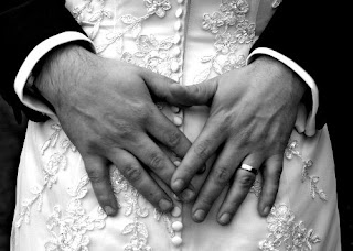
I save the new image, then I open it again so that I can really start changing it in Photoshop.

- I use Clone Stamp Tool to vanish the hair on the hands first
-Then I use Brush Tool with Soft Light Mode for coloring the hand.
- To have the color of real skin, I open any pictures that shoots people (For example: the left image). Next I use Eyedropper Tool and select the skin color I want to obtain. The use the Brush Tool with mode I chose to color the hands and it will be like this:
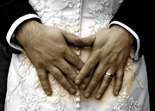
>>>>>>>>
EXAMPLE
(This picture I haven't vanish the hair yet)
- After that, I use History Brush Tool to disappear the color out side the hands.
- Next, I create frame for this picture by going to Image and select Canvas Size, I change the size into 7.944 x 5.958 inches.
- Finally, I make some text in the picture and... DONE!!
When I right click at the layer of font and choose Blending Options. I have fun in adding some effects to the font:

The first option

The second option
So, which one do you think is better?
Reference: http://freedigitalphotos.net/details.php?gid=167&sgid=&pid=2050
PLAYING WITH PHOTOSHOP - 1st time

This is my first entry and so, I think I begin it with practicing Photoshop.
The picture on the left is the original image. It looks a little boring, so I'm gonna make it more interesting. Here are the steps:
- First, I use Magic Wand Tool, then I click at the background of the picture and there will be dash lines around the object.

- Next, I use Gradient Tool and I choose color black and white. When I click and drag in the background image from up to down. It turns to be like this ----------------------------------------------->>
- After that, I use Clone Stamp Tool to vanish the font "123RF", then I re-painted the bow with Brush Tool and I utilize the Normal mode, Darker Color, Color Burn and Lighten mode to color it.
- Now to highlight the object, I choose History Brush Tool and I click and drag the mouse around the tree. After done that, I change the Normal mode of History Brush Tool into Dissolve mode, then I multiply click the mouse around the object to create white spots.
- Finally, I use Brush Tool again and decorate the darker area above in the background to make the image more exciting.
And HERE ARE THE RESULT:

This is just some of the basic skills when using Photoshop, but it help me to get use to it and I am still trying to play with Photoshop.
Reference: http://www.123rf.com/photo_2046691.html
- After that, I use Clone Stamp Tool to vanish the font "123RF", then I re-painted the bow with Brush Tool and I utilize the Normal mode, Darker Color, Color Burn and Lighten mode to color it.
- Now to highlight the object, I choose History Brush Tool and I click and drag the mouse around the tree. After done that, I change the Normal mode of History Brush Tool into Dissolve mode, then I multiply click the mouse around the object to create white spots.
- Finally, I use Brush Tool again and decorate the darker area above in the background to make the image more exciting.
And HERE ARE THE RESULT:

This is just some of the basic skills when using Photoshop, but it help me to get use to it and I am still trying to play with Photoshop.
Reference: http://www.123rf.com/photo_2046691.html
Subscribe to:
Comments (Atom)


